

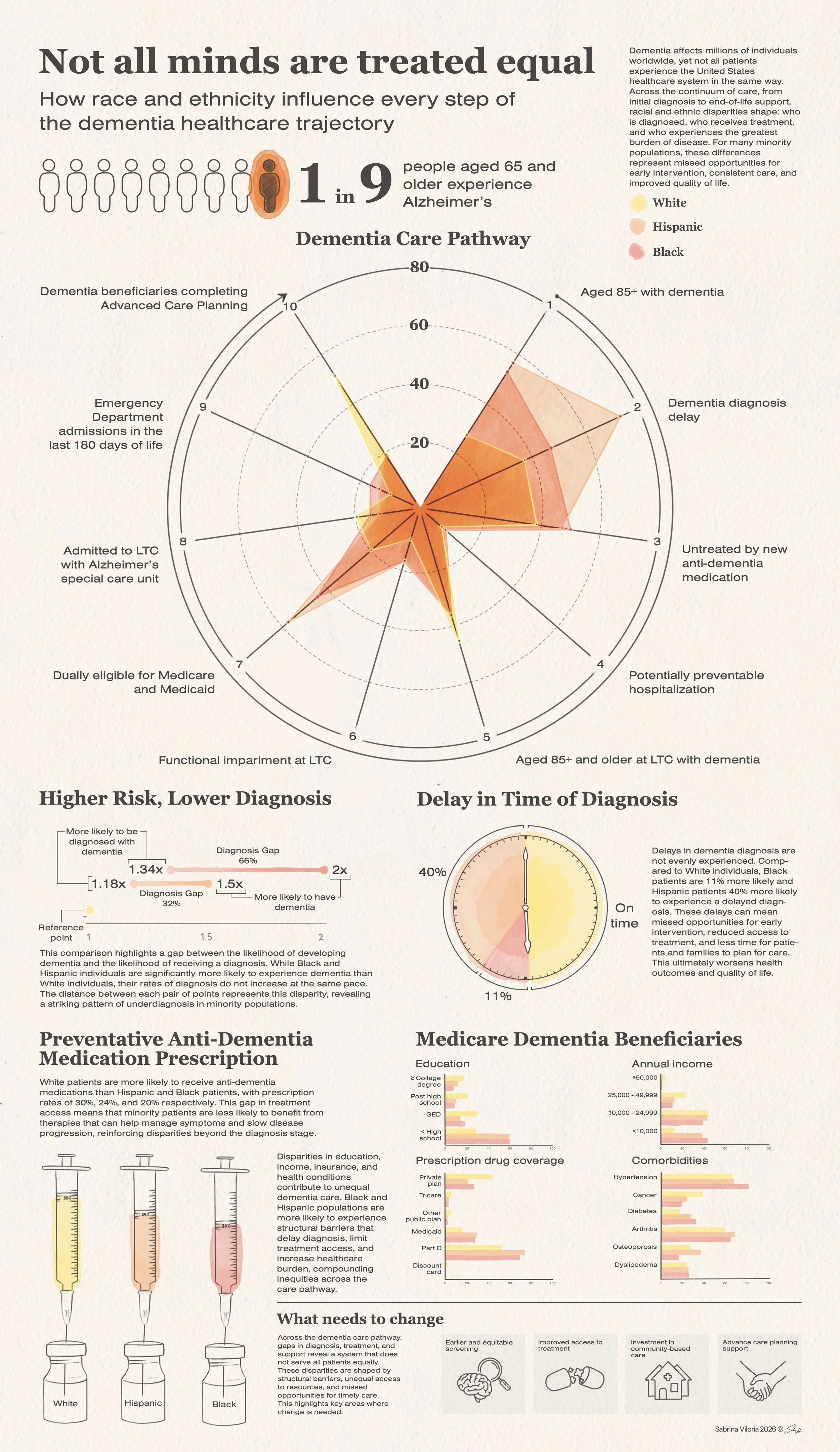
Not all minds are treated equal
Data visualization
This data visualization explores racial and ethnic disparities experienced by individuals living with dementia across their healthcare journey, from diagnosis to end-of-life care. Drawing from multiple clinical studies and review papers, the piece maps how inequities in access, treatment, hospitalization, and long-term care accumulate over time for Non-Hispanic Black and Hispanic populations compared to White populations. The final visualization combines infographic design with watercolour rendering to communicate both statistical findings and the emotional weight of these disparities. The project aims to make complex public health data more accessible to an educated lay audience while drawing attention to systemic gaps in dementia care.
Research
The research process for this project centered on translating dementia disparity healthcare data into a cohesive visual narrative. I began by reviewing scientific literature on dementia-related healthcare inequities before identifying a major scoping review that synthesized findings from 71 studies on racial and ethnic disparities in dementia care. From this review, I selected and extracted data from eight research papers spanning diagnosis, medication access, hospitalization, long-term care, and end-of-life treatment.
During the visualization process, I evaluated multiple graphing approaches and adapted my design strategy based on the structure and limitations of the datasets, ultimately selecting visualization formats that best communicated comparison, delay, and cumulative disadvantage.
Layout ideation and comprehensive sketch
I focused my sketching phase on building a visual narrative that communicated dementia care disparities as an accumulating experience rather than isolated events. Early planning explored how to guide viewers chronologically through diagnosis, treatment, healthcare access, long-term care, and end-of-life outcomes while maintaining clarity for an educated lay audience.
I developed a comprehensive sketch that mapped potential graph types for the statistics I was finding in my research. I created concepts such as a clock-inspired pie chart for delayed diagnosis and syringe-shaped bar-graphs for medication disparities at this stage to create a visually comprehensive and engaging reading experience that reinforced the meaning of the data.
Data compilation and rendering
I began the data compilation by narrowing the information I wanted to include in the graph. After extracting, cleaning, and organizing datasets from multiple research papers, I explored several graphing methods in programs such as RawGraphs and Datawrapper, refining choices based on the relationships and limitations within the data.
As visual development progressed, the project shifted away from more conventional data infographic aesthetics toward a painterly, watercolour rendering style. This approach allowed the visualization to maintain scientific clarity while visually reflecting the instability and unpredictability associated with dementia. I used texture and colour to heighten emotional resonance without compromising readability.
Layout and style
In the layout stage, I prioritized presenting the data in a manner that made it intuitive for the reader to follow the chronological presentation of the information.